Layout and Form Editor
Overview:
Allows users to access the layout Setup and Form Editor for various RMS 3 Modules.
The user can add their own custom cells, set permission on cells and add other various rules.
Users can also manipulate and design their own custom tabs within a module.
Note – Users should never change the basic concept of a module and design it into something else. For example, take the Impound Module and design it into a Daily Diary. This type of customization is not supported.
IBR required fields cannot be hidden, deleted or have field group permissions if you are IBR reporting agency. - See link IBR Required Fields
State Reports "Arrest Report, Incident Report etc" required fields cannot be hidden or deleted this may result in those reports, not populating data correctly.
Exceptional care should be taken when making form changes to ensure you do not break the module or the ability to generate reports, IBR checking, and simple rule checks.
Layout Setup:
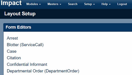
Layout Setup
- From Layout Setup users can select which module they would like to edit.
Form Editor Overview:
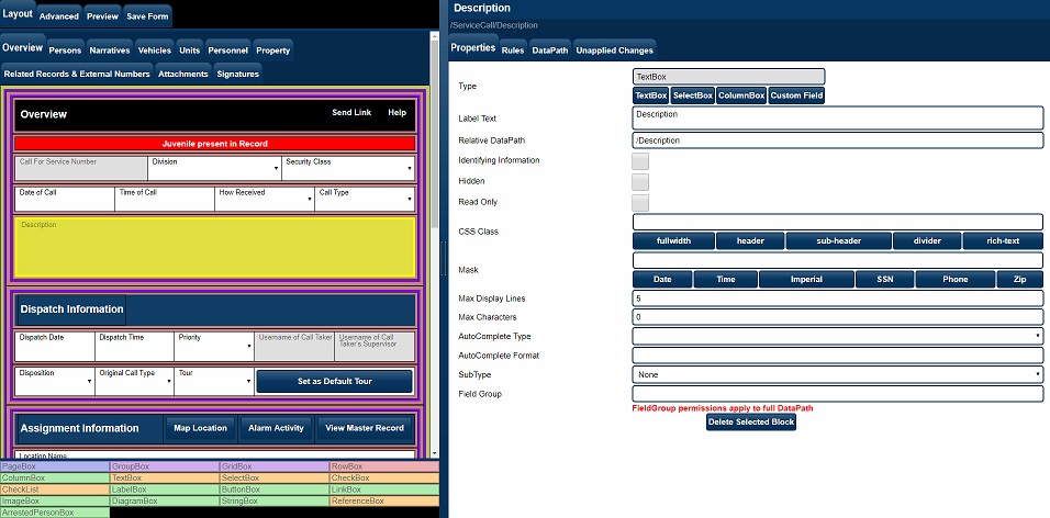
Form Editor Overview
- We will go over individual sections of the Form Editor.
Layout - Properties:
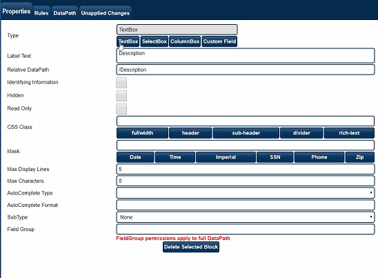
Form Editor Properties
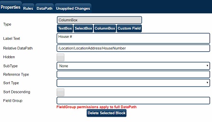
The Properties section allows each block to be fully customized.
- Type determines which HTML tags will be generated when the page itself is rendered – it should be set correctly in most cases, though the ColumnBox button is useful when building a GridBox.
- Label Text is the text that the user will see for the given block.
- Relative DataPath is (as explained earlier) the most important part of the properties. It uses XPath syntax to describe where the data for a field will be stored within the underlying XML record. The full DataPath is constructed taking all container elements into account (the full DataPath for the currently selected element is displayed above the properties section)
- If Identifying Information is checked, any change the user makes to the field will trigger the “Is this a new master?” question to appear. It should be used on things like SSN and LastName, in order to prevent incorrect information from contaminating master records.
- CSS Class is used for determining the styling to apply to the block. “rich-text” is a special option for TextBox fields, which gives them a full-text editor style – it also changes how the data is stored, however, so should be used sparingly (typically reserved for narratives).
- Mask is only applicable to TextBoxes and serves to limit what characters a user may type into the field. A * character allows any character to pass through, a # allows only numeric characters (0-9) to pass through, an X allows only alphabetic characters to pass through (a-z or A-Z), and a ~ allows either a numeric character (0-9) or the next character in the mask (used for Dates and Times). Any other character is taken directly from the mask.
- Max Display Lines changes how a TextBox is displayed to the user (anything more than 1 will allow paragraph style entry).
- Max Characters limits the maximum number of characters a user may type into a TextBox (does not apply to “rich-text” fields). 0 means unlimited.
- AutoComplete Type is used when searching for master records (the pop-up window that appears when “SMI, J” is typed into the Last Name field, for example) – care must be taken to ensure that the DataPath is correct for the selected AutoComplete Type. The Person lookup (for example), must be placed on a /Person/LastName field – if the user selects a person, the entire /Person will be overwritten with the response from the server.
- AutoComplete Format is used in a TextBox to populate the results of an AutoComplete search using variables.
- AutoComplete Variables are String values for AutoCompleteType when searching Master Personnel would be {/Rank} {/LastName}, {/FirstName} ({/SerialNumber}). User for populatiing all information in a single TextBox.
- SubType is used for special handling of certain types of fields. Dates and Times (for example), are stored in the underlying XML in a different format than what is shown to the user. The Imperial SubType should be used in conjunction with the Imperial mask for doing feet and inches style measurement input.
- Read Only makes the field unchangeable due to direct user interaction.
- Field Group is used for grouping items for the permission handling – allowing explicit permissions to be set in a fine-grain manner. If a block has a Field Group assigned, all blocks contained within that block will be considered part of the Field Group as well.
Layout - Rules:
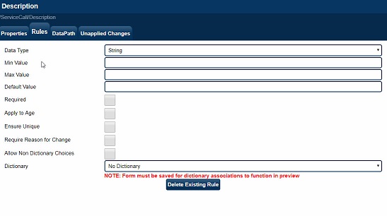
The Rules system allows minor error checking to be performed in the browser, as the user is interacting with the form. The user will not be allowed to save the form unless all rules pass.
- Data Type specifies that the user input must be able to convert to a given type. This will typically be set automatically as needed.
- Min Value specifies that the user input must be greater than or equal to a given value (which is typically a number).
- Max Value specifies that the user input must be less than or equal to a given value (which is typically a number).
- Default Value specifies a string to use as the initial starting value for this field – with %NOW%, %USERNAME%, %USERSERIAL%, %USERSHIELD%, %USERLASTNAME%, %USERFIRSTNAME%, %USERMIDDLENAME%, %USERGUID%, %USERRANK%, %USERDEPARTMENT% and %USERCOUNTY% being special cases. In addition, an absolute DataPath may be supplied to pull a default value from elsewhere in the form.
- Required forces the field to contain information.
- Apply to Age is only valid for a DateOfBirth field, and causes that value to be propagated to the corresponding Age location.
- Ensure Unique forces all items in a list to be unique.
- Require Reason for Change causes a popup dialog to be displayed to the user if any change is made to the field. The information supplied by the user is recorded in the Audit Log.
- Dictionary is probably the most important rule – setting the list of valid choices necessary for a SelectBox to function correctly.
Form Data Input Items:
Form Data
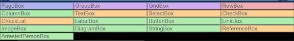
- Pagebox - Represents a Tab on the Form.
- GroupBox - Simple Container that can hold several rows.
- GridBox - Similar to a GroupBox but tie to a list of objects. (A list of person, vehicles, addresses etc).
- RowBox - A container that will hold - TextBox, SelectBox, CheckBox. is also used as a Header, SubHeader.
- Column Box - Used for the listing of Objects Example would be Lastname, FirstName for several entries to show in a list.
- LableBox - Used with a Row Box to add Labels to a GroupBox.
- ButtonBox - Adds a button to your form to perform an action. Example Printing a Report, See drop down for all Action Functions.
- link box - Similar to an ActionButton but will open a URL to another website.
Column Sort Configuration:
Form Editor ColumnBox
- Sort Type - First or Second Column to be used as a sort criteria
- Sort Descending - Unchecked Sorts Ascending.
Sort By Date Created/Entered:
Created Date
- Screen capture shows Column Create Date added to Addresses.
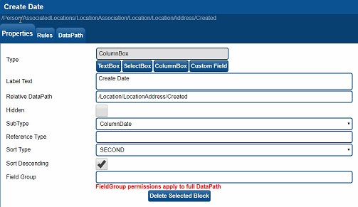
Created Date
- Screen Capture illustrates the settings for the Create Date column.
Unapplied Changes:
Select Link to view documentation on Unapplied Changes